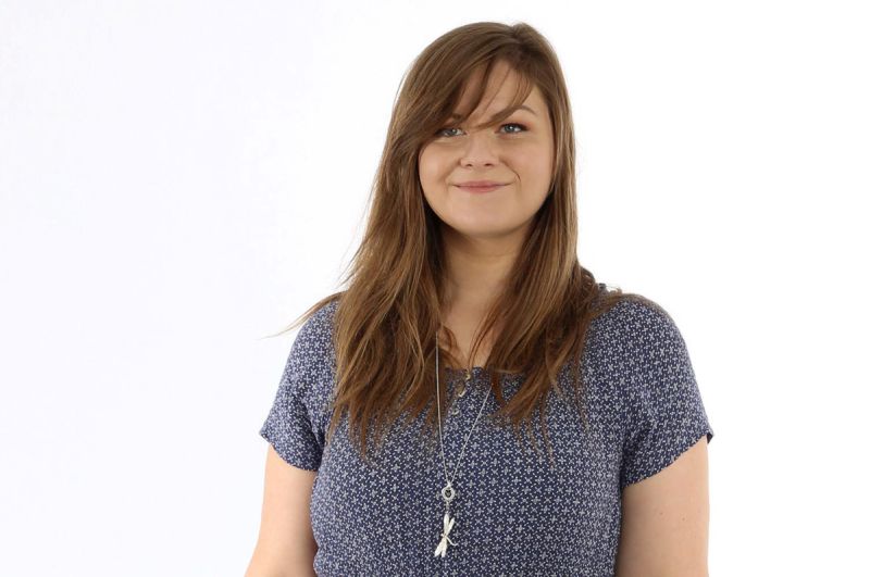
Miriam Bottesch is working as a User Experience Designer at the User Interface Design GmbH. She has extensive experience in the user-centered design of products from various industries. Miriam Bottesch studied communication design at the University of Design in Schwäbisch Gmünd and graduated with a Bachelor of Arts.
Smart HMI: Hello Miriam, You and your team played a key role in the interaction concept and graphic design of the WebIQ Designer. Meanwhile, your child is running and will be delivered to the first customers. Are you happy?
Miriam: Since 2017, my colleagues and I have been working to bring the WebIQ Designer to the market. I’m very happy, that it is now the time and I’m looking forward to the first feedback from the users.
Smart HMI: How did you proceed the development of the interaction concept and the graphical design?
Miriam: As with all our projects, we were designing the WebIQ Designer according to an iterative and user-oriented design process. UX experts, graphical designers and software engineers worked hand in hand. At the beginning of the project, we developed the interaction and navigation concept of the WebIQ Designer, as well as the basic layout. In the next step we defined the design style. I took over the project from a colleague in autumn 2017. The rough design already existed at this particular time. Nonetheless, there were still some challenges to overcome, such as designing the Trend Display or optimizing the tool and drawing area. As a UX designer, I always question existing solutions and develop new ones. I always have the users and their needs in mind.
 Working dashboard in the UID project room
Smart HMI: What was your biggest challenge?
Miriam: The users should be able to create, extend or adapt an HMI without HTML knowledge with the WebIQ Designer. Therefor we provide a tool area – the so-called “Cockpits” – which offers all functions to create and configure the HMI on the drawing surface. A big challenge was to design the two areas – the drawing and the tool area – in a way, that they are well distinguishable but perceived as belonging together. Among other things, a shadow under the drawing area visually highlights the workspace and clearly separates it from the tool area.
Smart HMI: Which solution are you particularly proud of?
Miriam: I’m particularly proud of our trend display solution. The trend display shows several parameters simultaneously over time. The trend curves has to be comparable, but also distinguishable from one another, despite of the limited space. The labels and controls, such as the legend, must be visually linked to the respective trend curve, so that the user can quickly recognize and assign it. Our solution: The trend graphs differ in their color as well as in their shape and typography. Through this multiple encoding we also consider users with visual defects.
 Design study for different selection modes
Smart HMI: Can you describe in a few words what constitutes the graphic design of the WebIQ Designer?
Miriam: The appearance of the WebIQ designer is characterized by a reduced color climate of anthracite and light gray. Colors are mainly used to highlight selected objects. This deliberate reduction allows the user to quickly orient themselves in the system. In addition, related elements can be detected faster.
While great art makes you wonder, great design makes things clear
(John Maeda, Author of “The Laws Of Simplicity”)
Smart HMI: The number of users of the WebIQ Designer is growing. Which feedback would you like to receive?
Miriam: Of course everybody likes to get a positive feedback. But I’m also happy about any constructive criticism, suggestions for improvement or even creative ideas for extensions that help to make the WebIQ Designer even better.
Smart HMI: Thank you for the interview.

